ParkZen
ParkZen is a concept prototype for a plug-in that helps Apple Maps users find, evaluate, and navigate to parking spots in crowded cities.
Year
2024
Project Type
Prototype + Case Study
Role
UI/UX Design
Project Overview
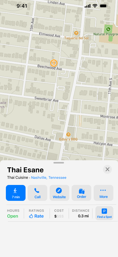
ParkZen is a concept plug-in for Apple Maps, designed to help users find, evaluate, and navigate to parking spots in crowded urban areas. Inspired by personal frustration with confusing signage and hidden lots in Nashville, ParkZen aims to reduce stress and uncertainty around parking by integrating a streamlined parking flow directly into Apple Maps.
This solo project was completed over four weeks as part of my UX design training. It includes user research, flow mapping, wireframes, and a high-fidelity prototype built in Figma. The case study that follows walks through my process — from the initial spark to the design solution — with a focus on accessibility, clarity, and ease of use in real-world environments.
The Story
One unexpected afternoon, my husband — a street poet in Nashville — found a hidden parking lot we’d never noticed before. The signage was misleading, the space was free, and the walk to Main Street took 30 seconds. This serendipitous experience made us realize: how many other parking gems are hiding in plain sight?
From that question, ParkZen was born: an embedded Apple Maps add-on that makes parking discovery feel clear, intuitive, and accessible to all.
The Problem
Finding parking in a city isn’t just inconvenient — it’s confusing, expensive, and stressful. Based on interviews and real-world observation, I identified three major friction points:
Availability: Users don’t know what’s open until they get there
Confusion: Poor signage and unclear interfaces lead to missed opportunities
Cost: Affordable options are often hidden or unclear
The current Apple Maps experience offers limited support for evaluating parking before you go — leading to frustration, missed turns, and late arrivals.
Research & Insights
To better understand the parking experience in Nashville, I explored local news coverage, surveyed residents, and conducted user interviews. My goal was to identify recurring frustrations and root causes — not just guess what people needed.
A quick survey revealed widespread dissatisfaction, and my follow-up interviews uncovered vivid stories of confusion, stress, and missed events — all due to unclear or inaccessible parking information.
Availability
“If I knew the first place I picked would have a spot, parking wouldn’t even be a thing I had to think about. It’s when you go somewhere and it’s full — that’s when the stress starts piling on. It’s like, why can’t we just know ahead of time?”
~ Participant 1
Confusion
“I honestly don’t get the parking setup in the Gulch — or really most of Nashville. It just doesn’t make sense. You’re driving around trying to read signs that contradict each other or don’t help at all. It’s so frustrating.”
~ Participant 2
of survey respondents said they regularly experience stress when trying to find parking in Nashville
82%
Key Insights:
users crave confidence and hate guesswork
Cost
“We tried a bunch of garages near the Schermerhorn, but everything was either too expensive or confusing to get into. We ended up being 30 minutes late to the show just trying to park. If someone had just told us where to go, we could’ve been on time and saved money.”
~ Participant 3
Inconsistent signage creates anxiety, wasted time, and gridlock
Unclear pricing leads to missed events, frustration, and mistrust
Design and Iteration
To address the most common parking frustrations, I explored ways ParkZen could reduce stress before a driver even leaves their home. Inspired by real stories and user needs, I sketched solutions, mocked up flows, and built an early prototype in Figma.
The design focuses on three key user goals:
Knowing where parking is available before arrival
Understanding restrictions and signage clearly
Comparing free vs. paid options at a glance
I iterated based on peer feedback, improving layout clarity, button consistency, and content legibility. Because ParkZen was designed as a plug-in within Apple Maps, I studied existing UI patterns and kept interaction consistent with Apple’s native gestures and components. This helped the feature feel like a seamless extension of the app — not a totally new tool.
Sketch
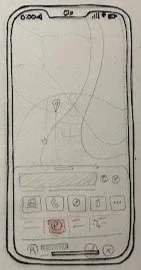
Sketch
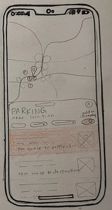
Parking Lot Card Information
Low Fidelity

Search for Parking
Low Fidelity
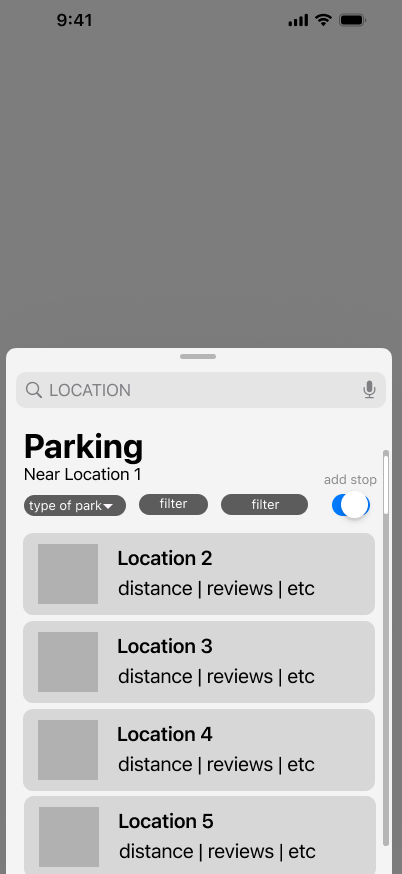
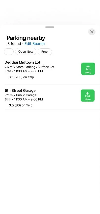
High Fidelity
Design System
see full sketches + mockups
High Fidelity
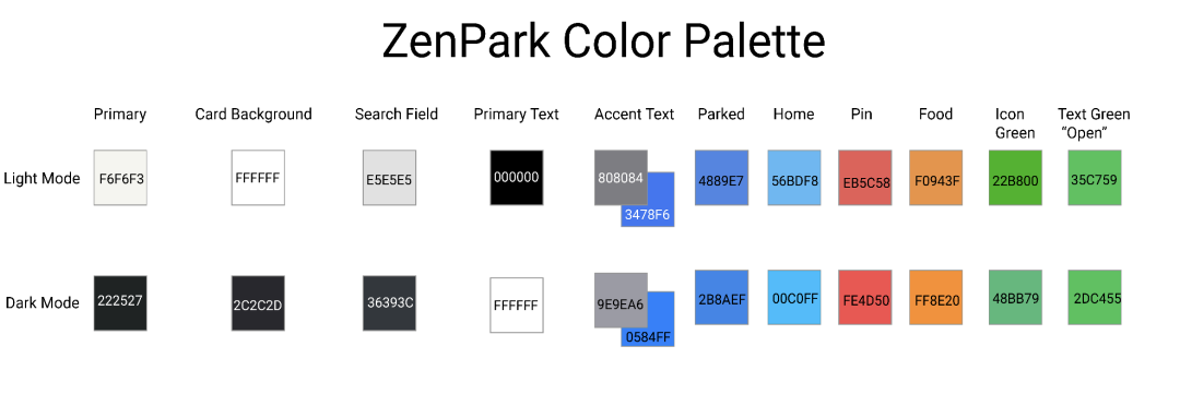
I felt it important to maintain the continuty of the Apple brand in my style guide, while building some dinstinction between the plug-in and the natural application. I kept all of the typography the same, and the most important colors as well, but dinstinguished how I used them. The blue and green shades were distintcive and provided a clear message: blue for parking, green for succcess. Additionally, blue and green are known for their calming tonalities and so made a great fit for ParkZen’s distinctive colors.
Final High Fidelity
High Fidelity Mockup
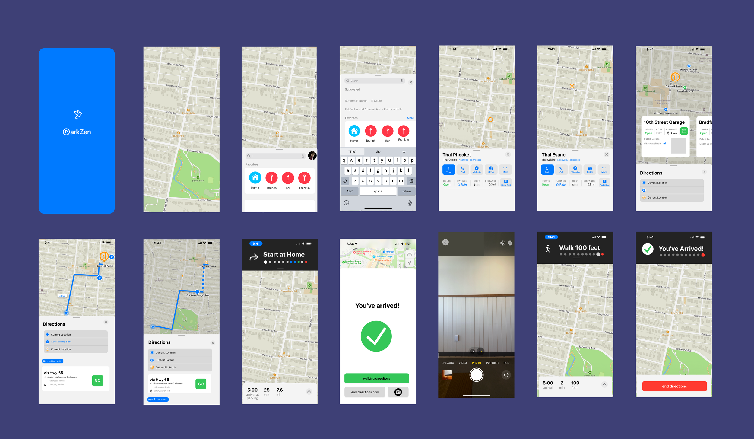
After three rounds of interviews and subsequent design iterations, both in flow and in visual design, I ended with a host of screens for my final prototype. You can see them in more detail here, but below I’ve placed them all side by side to get the bird’s eye view affect.

I iterated based on peer feedback, improving layout clarity, button consistency, and content legibility. Because ParkZen was designed as a plug-in within Apple Maps, I studied existing UI patterns and kept interaction consistent with Apple’s native gestures and components. This helped the feature feel like a seamless extension of the app — not a totally new tool.
Prototype
After building out the high-fidelity screens, I used Figma to create an interactive prototype that simulates ParkZen’s core flows inside the Apple Maps interface.
In early usability tests, users had trouble spotting the “Find Parking” button — it blended into the UI and competed with Apple’s native “Directions” button. Based on this feedback, I restructured the flow so that parking is selected after users begin route planning, not before.
This change made the experience more intuitive and more in line with real user behavior. I also added a “Preview Nearby Parking” option for users who want to scan options before committing to a route.
The final prototype includes:
A parking overlay accessible from the directions screen
A scrollable parking list with live availability, cost, and walking distance
A toggle between list view and map view
Please enjoy clicking through this project!
Reflection
Designing ParkZen taught me how powerful small UX moments can be. Something as mundane as parking holds emotional weight — missed plans, hidden costs, daily stress. I learned that clarity, timing, and flow matter just as much as the visuals.
This project challenged me to:
Trust real user stories over assumptions
Iterate even when the solution feels “done”
Work within existing systems (like Apple Maps) instead of reinventing them
Most of all, it helped me understand how design can bring a sense of calm and confidence to everyday city life.