MoneyCleanse
A financial wellness dashboard to help users get honest about their subscriptions — and take back control.
👉 Check out the case study below or check out the prototype
Project Type
Solo Project
Year
2024
Role
UX/UI Designer
Project Overview
MoneyCleanse is a concept for a mobile-first dashboard that helps people identify, reflect on, and manage their recurring subscriptions — without shame.
In a world of digital convenience, it’s easy to accumulate small, auto-renewing charges that quietly chip away at financial wellness. This tool acts like a reset button: giving users clarity, control, and emotional distance from their spending habits, so they can align their subscriptions with what actually brings them value.
This project was completed as my second capstone in Springboard’s UX/UI Design program. I led every stage of the UX process — from discovery and ideation to prototyping, testing, and iteration — with a focus on habit change, financial psychology, and accessible design.
The Problem
Modern budgeting tools track your spending — but they rarely help you make decisions about it.
For many people, subscriptions pile up quietly. A $5 streaming service here, a $12 app there… until one day, you realize you’re spending more on subscriptions than groceries.
Through user interviews and survey data, I uncovered three core problems:
Low awareness: People often forget what they’re subscribed to or how much they’re actually spending.
Emotional resistance: Canceling feels overwhelming, tedious, or even shame-inducing — like facing past versions of yourself.
Poor UX in existing tools: Most subscription management features are buried, overly transactional, or don’t prompt meaningful reflection.
People didn’t need more data. They needed clarity, emotional distance, and an easy way to act.
That’s where MoneyCleanse comes in: a judgment-free dashboard that helps users reflect, reassess, and reset.
Research
To ground my design decisions, I studied three popular tools: Trim by OneMain, TrackMySubs, and Rocket Money. Each offered valuable features — but also revealed critical UX gaps that shaped my approach.
Trim uses automation to cancel subscriptions for users, promising convenience but removing user agency.
TrackMySubs organizes subscription info in a calendar format, but lacks emotional or behavioral insight.
Rocket Money gives users a broad view of spending, yet its UI can feel dense and overwhelming for those already stressed about money.
Across all three tools, I noticed a pattern:
They prioritize automation and dashboards — but neglect mindset, clarity, and emotion.
My users weren’t just asking what they were spending on. They were asking:
"Why do I keep forgetting what I’m subscribed to?"
"How can I feel more in control without getting overwhelmed again?"
This told me that the design needed to:
Make space for reflection, not just data
Offer clarity without clutter
Provide a gentler, shame-free experience tailored to real-life emotional needs
This analysis helped me reframe the challenge:
Instead of building another tracker, I needed to design a supportive reset tool that helped people take stock, pause, and re-align their choices with their values.

User Research Insights
I asked these questions:
How do people currently track and manage their digital subscriptions?
What pain points do users encounter when attempting to cancel or adjust subscriptions?
Which features (e.g., notifications, central dashboards, unsubscribe options) do users find most valuable?
How do users perceive subscription management tools in terms of trust, reliability, and usefulness?
What type of language, tone, and experience best align with a “trusted friend” brand personality for this type of product?
I learned that:
Tracking is fragmented: Users often tracked subscriptions manually, across email, bank statements, and spreadsheets—if they tracked them at all. This led to stress and missed charges.
Cancellation is confusing: Many users reported friction when trying to cancel services. It was often unclear how to cancel, how long the cancellation would take, or what steps were involved.
Value is unclear: Users didn’t always know what they were paying for or if they still needed it. They wanted clear breakdowns of cost, category, and timing.
Tools lacked warmth and flexibility: Existing tools felt overly corporate, untrustworthy, or too rigid. Users wanted a tool that felt like a “trusted friend” — clear, calming, and supportive.
Notifications are helpful—but only if done right: Users valued reminders but didn’t want to feel bombarded. They preferred gentle, timely nudges with meaningful info, like “this subscription renews in 3 days.”
Visual hierarchy matters: Users liked seeing totals and charts, but they especially appreciated when key info—like billing dates or categories—was right up front without needing extra taps.
Desire for control: Users wanted to act quickly from the dashboard: cancel, set reminders, or update details without navigating through multiple menus.
“Is this from today? This week?
I need to know what timeframe I’m looking at.”
~ User Interview
“I don’t like to think about it- when I do I tend to freak out and download every budgeting app, but when I look at them I get more overwhelmed.”
~ User Interview

Synthesis and Design Goals
Based on the research, I identified a few core desires from three user perspectives I wanted to design for:
As a current user, I want to see all of my subscriptions in one place so that I can get a comprehensive view of my spending on subscriptions
As a returning user, I want to unsubscribe from a subscription so that I can reduce needless spending
As a consumer, I want to be notified if any of my subscriptions are about to be auto-renewed so that I can make a decision about if I want to renew the subscription and continue spending money
From here, I defined three design principles to guide the rest of the process:
Clarity in UI and messaging (this isn’t geared towards people who love budgeting- those people already have their excel spreadsheets down pat)
Focus on what users want to do most (cancel, understand, reduce)
Support through tone, visuals, and interaction design
I also created this list of goals as a result of my casual interviews, when together with an interviewee I walked through the competitors sites and asked what they liked and what didn’t work, and why.
Cards help make all the subscription data readable!
Need a space to take notes, as cancelling membership tends to be multistep.
Need a way to “go back” at every turn.
Setting alerts from the subscription card itself.
Goal: reduce mental load to understand data.
List of subscriptions on home page, no clicks.
Language clarity. No “lifetime deals”! ?
Like seeing total spent on subs, and visual charts for how much in each category.
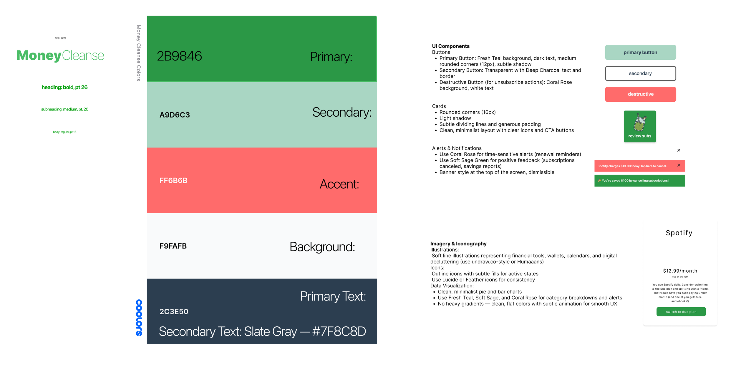
Design System
My brand guidelines and design system are mutually symbiotic. MoneyCleanse’s brand personality is “a trusted friend who is helping you save money”. Of course, I had to balance this with the user desire to not be “too gimmicky”. No avatar, no mascot, no talking animals.
Brand attributes
○ Trustworthy
○ Caring
○ Friendly
○ Casual
Accessibility and friendliness guided my work here. Below you’ll find my design system, with color palette chosen based on warmth, friendliness, and positivity. The feel is doing a one day juice cleanse with your friends- a “quick fix” that lasts, shaping into long term habit change. It’s approachable, with a low entry ceiling, but it’s helpful, and so users return over and over.
Ideation
Armed with a design system, user and competitor research, and design guidelines, I identified my initial red route ideas and began sketching.
Red route ideas:
View All Active Subscriptions
Cancel a Subscription
Get Renewal Reminders
Categorize Subscriptions for Budgeting
Monitor Changes to Subscription Charges
Guide New Users with Clear, Calm UX
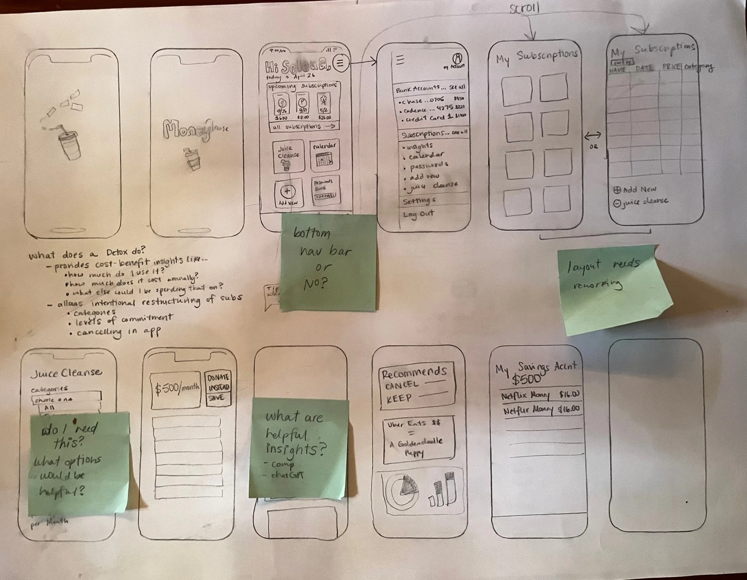
I sketched out the MVP red routes on paper. With the time constraints I chose to reduce as many features as necessary to as few screens as possible. Most every feature is accessible from the homescreen within one or two clicks.
Validation
After initial testing of the low fidelity frames I realized the subscription list needed to be primarily located on the homescreen, not on a separate screen. I also realized my idea to make a “savings account” a user could repurpose their cancelled subscription money towards was outside the scope of the project I could reasonably complete on my timeline, so we paused that element in this round of design. Here are all of the insights gleaned from this round.
1. Ambiguity in "Add New" Goal Button
Finding: Users were confused by the lock icon on the "add new" goal card. Some thought it meant the feature was locked behind a paywall.
"Wait, do I need to unlock this? Why is there a lock on 'add new'?"
Solution: Replace the lock icon with a plus sign. Rename the button to "Create New Goal" to better reflect the action and remove ambiguity.
2. Dashboard Stats Lack Context
Finding: The meaning of "14 canceled" and "5 remaining" was unclear. Users asked if this referred to the current month, year, or all-time.
"Is this from today? This week? I need to know what timeframe I'm looking at."
Solution: Add clear time indicators like "this month" or provide hover/microcopy explanations. Example: "You canceled 14 subscriptions this month."
3. Subscription Cards Need More Information
Finding: Users wanted more actionable info on individual subscription cards, such as billing date, category, and cancellation options.
"I want to see when Spotify charges me, or if I can pause it right here."
Solution: Expand the card view or include collapsible details with category tags, billing cycles, and quick action buttons like "Set Reminder" or "Cancel Now."
4. Unclear Call to Action (CTA)
Finding: The “Take Action” button on the insights dashboard was too generic. Users were hesitant to click it without knowing the result.
"Take action… like what? Am I canceling something or just getting tips?"
Solution: Clarify the CTA label, e.g., "Review & Cancel Subscriptions" or "See Smart Suggestions."
Final Designs
These screens reflect the final high-fidelity UI after several rounds of testing and iteration. I focused on reducing cognitive load, prioritizing clarity, and making subscription management feel simple and approachable. The interface is designed for mobile-first use with intuitive navigation and gentle visuals.

Reflections
This sprint was a fast-paced exploration of a very real user pain point. I’m proud of the core functionality I was able to prototype in a short time, but I also identified several areas I'd revisit or expand:
Visual Design: The current color system could be softened to better reflect the calm and supportive tone I intended. With more time, I'd revisit the design system to improve accessibility and reduce visual strain.
Notifications: A key user request was proactive reminders about upcoming renewals. Due to time constraints, I wasn’t able to build out this flow fully, but it’s a high-priority next step.
Scope & Trust: The concept raised real questions around user trust, especially when it comes to linking financial accounts. One area I’d explore further is how to offer value without requiring third-party banking access, perhaps by offering a manual input option or passive monitoring feature.
Feature Expansion: I identified more red route ideas than I could execute during this sprint, including better categorization, budget tracking, and personalized insights. With more time, I'd validate and build these features to strengthen the MVP.
This sprint clarified a lot for me about how to balance scope, trust, and clarity, especially in products that touch sensitive user data.